This post is a breakdown of the BenWander_StyleDemo that I posted earlier this week. I know, a blog entry on a Monday is sacrilegious, please forgive me my sins. If you missed it, I fully understand, but I would love if you gave it a try before reading the rest of this post, as I’d prefer to avoid tainting your opinion before you play it. Then again, I ain’t your mother, do what you want.
With the BenWander_StyleDemo, I needed to resolve two nagging issues:
- How would I write and implement an interactive story?
- What will this game look like?
Making the demo took the full first month in Thailand, thinking of solutions then discarding them — a virtual mountain of crumpled paper in my Mac’s trash bin. In the end, I like my general solutions, though I will change some minor aspects moving forward. Let’s start there, then I’ll tell you what’s next.
The most stimulating source for a solution to a problem comes from the problem itself.
Writing anything can be a stupefying endeavour — even these blog entries involve much caffeine and agony. This game will require a lot of writing, and will also include interactive player choices that lead the story in many directions. I need a better strategy to keep organized. And some way for a computer to read my text as a narrative with multiple branches. What was that about stupefying?
After a lot of research and testing, I finally settled on Twine 1.4 with UnityTwine. I can write my story in a coherent graph format, my game’s visuals can react to player choice, and my narrative and characters can remember the player’s actions. There are many other fucking awesome appealing aspects of this system — and one day I should write a full entry about them — but let’s not get too jargon-heavy, this post will be long anyway. Just know that the story-system for the final game is fully implemented right now. Damn, that felt good to write.
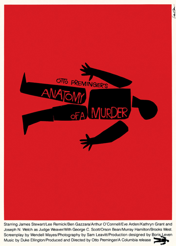
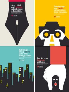
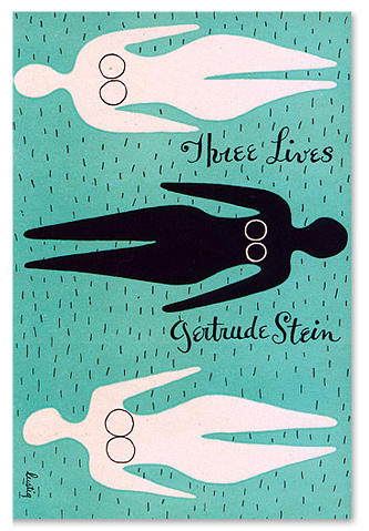
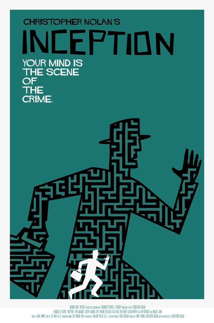
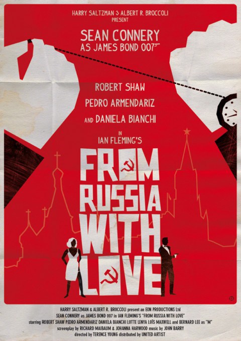
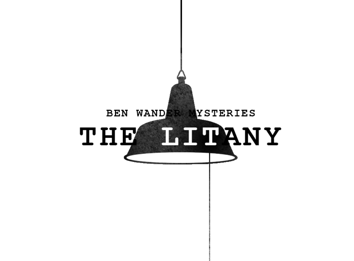
From caricatures to art-deco, this game had gone through many visual styles before arriving at this one. Dino Ignacio actually nailed it in his comment — “It reminds me of Saul Bass’s title design” (oh man, there isn’t a much better feeling than when someone you professionally admire understands the intent of your work). I actually got into Saul Bass after a coworker showed me his profile on Art of the Title back in 2009. The simple shapes, clean animations, suspenseful music — every element added for a specific purpose. These ideas are magnified by his film posters (see gallery above) where he and his contemporaries created a bold and unique style still emulated today (the final two images aren’t from that era, but inspired by the work). Saul Bass, Paul Rand, Alvin Lustig — all have clean visual designs that are perfect for what I’m trying to do. I can’t believe it took so long for me to think back to this style; it fits with my mystery theme and can be easily animated (and perhaps even programmatically coloured) to fit the mood of any scene.
Failure is built into creativity
I like the decisions spurred by this demo, but the full game needs some improvements. The most blatant is the writing. If I’m honest, the text was mostly filler to test the Twine-to-Unity pipeline, but not indicative of the writing-style or the story. On a similar note, the text animation feels worse every time I play the game — it appears slow, the words jump lines, and players don’t even know that they can scroll the text-box (try it! You can actually click on the text and move it up and down! I know, not obvious, right?!).
The art, too, has its issues. I like the “stamped” feel, where I don’t perfectly fill each shape with colour, which captures the techniques that Bass et al. used in the pre-digital era. But, I overused this technique in the demo — there are some blurred and aliased edges that are intentional, yet just look like graphical bugs. I’d like to swap these for clean lines, making any “imperfections” a more obvious stylistic choice. With that in mind, I may actually 3d-model the more important shapes, which would make every edge feel crisp, regardless of resolution or zoom. There are also more interesting ways to incorporate the titles of each scene, and the imagery may shift towards abstract depending on the context.


Symbolize and summarize
So what’s next? From general concepts like “add audio” (ho boy, talk about an elephant in the room) to major game mechanics like scene traversal and clue finding, to minor but important house-cleaning, like better organizing my AnimationControllers, there is so much still to do before this even resembles the intended final game.
That said, this style-demo let me answer some important questions, while giving me a wonderful taste of working for myself. I intend to have a more complete demo by the end of my time in Thailand (but, no deadlines!) which will showcase the rest of this game’s features. Some readers have asked to have more updates on the game as it progresses. Fair enough, I’ll make sure to include at least a brief update on the game’s development with every post.
And, honestly, thanks for coming along. I never imagined that I’d have an audience for these entries — I thought, maybe, if this game found a niche, the blog could be a nice behind-the-scenes. But, knowing I have even a small readership is fantastic. Thank you for your support! I hope the next year will justify it.
All quotes by Saul Bass
First row of images: Anatomy of a Murder (Saul Bass), IBM Posters (Paul Rand), Three Lives (Alvin Lustig), Inception (RodolForever), From Russia With Love (Alain Bossuyt)
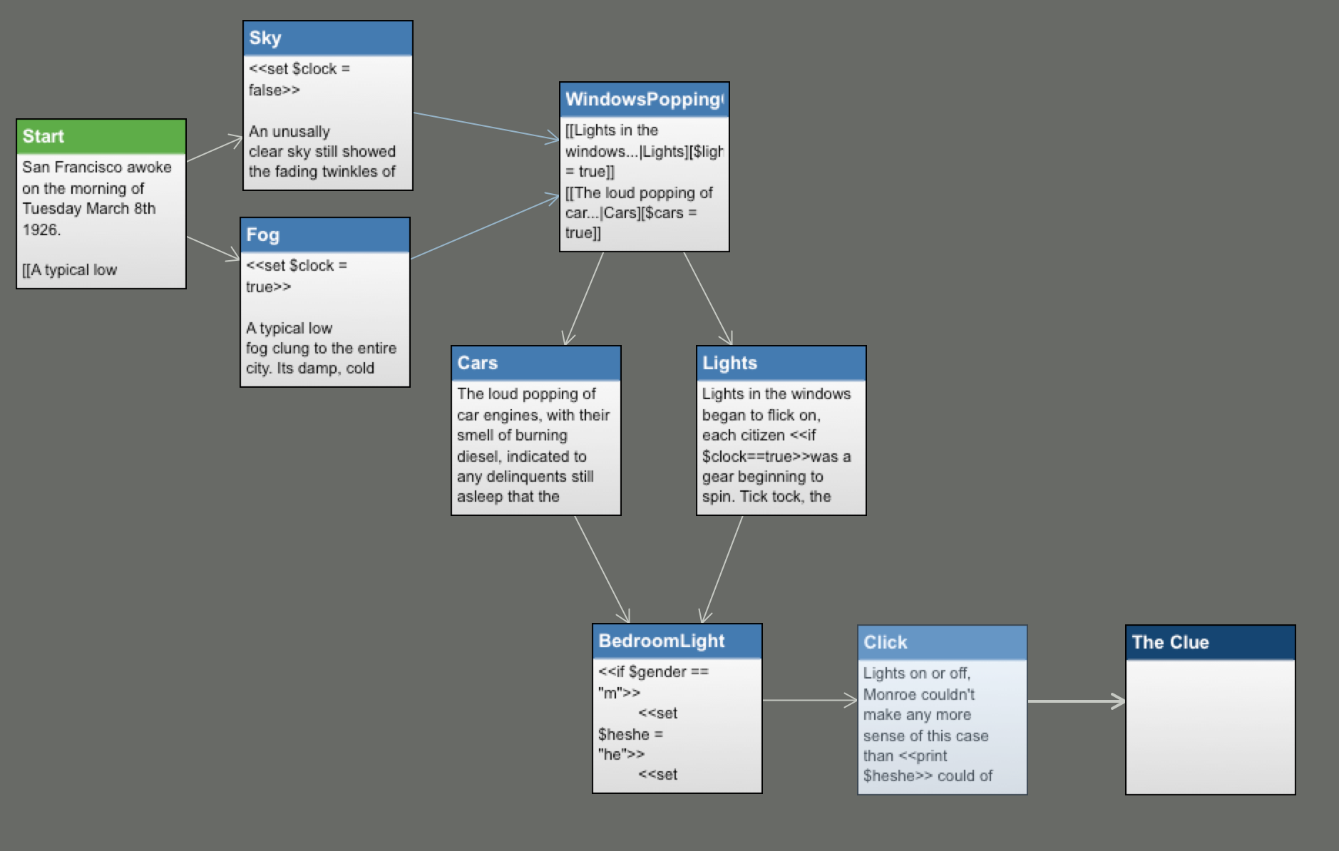
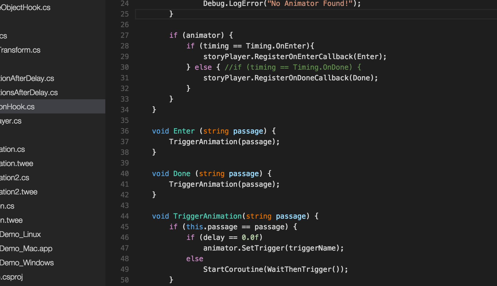
Final row of images: Text in Twine 1.4, The Actors Before Curtain, Animation Hooks, A Failed Style, I Like The Title
Comments
One response to “Breaking Down the Style”
[…] game hasn’t seen much content created this week. After developing the style-demo, I realized I still had a lot of questions, so I’ve been gathering more inspiration. I’m creating […]